Email design can be a tricky thing to master. You want your email to look professional, but you also want it to be eye-catching and readable. Most importantly, you want to encourage the receivers to click on your CTA but at the same time, you don’t want to be too salesy.
Such a headache!
Worry no more! In this blog post, we would give you a step-by-step guide to creating an effective Email Design!
How to create effective Email Design
1. Craft a Compelling Subject Line
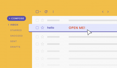
As mentioned before, the email subject line is the first touch point for your customers. Hence, it can make or break your email marketing. Your subject line should be enticing and attention-grabbing enough for the receivers to open. It should also be short, concise and straight to the point because there is a character limit when it is shown on the phone.

Another tip for writing a compelling subject line for eCommerce is the use of suitable emojis. This makes the subject line pop out among all the text-based subject lines and it is more attractive too. If you’re interested to learn more about writing a subject line, you could check out our other blog, How to Write a Good Subject Line that Boosts Open Rates?
2. Focus on the Header
Similar to the subject line, the header or the top part of the email is the entity that decides whether your email is worth reading to the end. You shouldn’t reiterate what you have said in your subject line on the header, however, you should directly state your objective. Make it extra eye-catching!
3. Include Visual Content
Your B2C emails should never be text-heavy! Layman consumers prefer visuals over text, so focus your effort on creating aesthetically pleasing visual content instead. This includes lifestyle photos, product shots, as well as graphics, illustrations and simple but dynamic data visualizations.
When designing your email, you should pay extra attention to the images you use. Pictures speak louder than words, and a high-quality one can effectively boost your brand confidence in your customers. Avoid using stock images, or low-quality pictures that are pixelated. These images don’t only ruin your brand reputation, but also create frustration for the receivers.

Other than that, it is encouraged to include relatable illustrations and graphics to reinforce your email design. Not only do they help increase the visual appeal, but they also help emphasize the points and make the dull design more interesting.

Simple data visualization is a strong tool to help communicate your story and persuade your customers. They help boost your brand image by building credibility and authority.
4. Write Concise Copy
Stay away from long paragraphs! You should only write what’s necessary for your email.
People now have a very short attention span. They only want to read what is important to them. So, it is completely useless if you send them long paragraphs of your brand story. Your copy should be able to enhance your images. Make them strong, powerful and impactful enough so that the receivers would be convinced to follow the directions and complete the actions.

One thing you should be aware of is the copy’s alignment and line breaks. Make sure to test them on different devices so that the words are readable.
5. Optimize your CTA
Call-to-action (CTA) is a major element of your email that encourages your customers to take action. It could either be directed to your eCommerce site, sign-up forms, coupons or discounts. Particularly, you should always follow the rule: One Email, One CTA. Providing a complicated CTA would never help you as it confuses the readers. Your CTA should be clear, visible and enticing. When designing, make your CTA button pop with vibrant colours or shapes.

6. Use responsive design
As crucial as it is to have an attractive design, your email should also have a responsive design. The email should be optimized to fit all types of screen sizes, devices and platforms because you’ll never know what your audience is using to open your email. Having a responsive design also enhances user experiences and leaves a good brand impression in your audience’s mind.

7. Include an Unsubscribe Button
An unsubscribe button is just as important as a CTA button. Your email receivers would appreciate you if you give them the autonomy to interact with your emails. Moreover, it is also required by law to include the unsubscribe button in email marketing or newsletters.

8. Adhere to your brand guidelines
Last but not least, you should always stay on brand. Brand consistency strengthens brand recognition and customer loyalty. Hence, you should always follow your brand guideline.
All in all, it is possible that even after you have followed all the design tips and still end up with a low open rate. Therefore, it is important to conduct A/B testing to see what works best for your business. There is no one-size-fits-all anyway, so every industry’s email varied. If you are unsure about this, the best way to do this is to get in touch with a design agency.


